

| SEARCH |


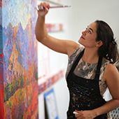
Painting at Colossal Scale
A Look at Erin's Trajectory as an Artist
Thursday, May 1, 2025
If we stepped back in time thirty-two years, we’d find a young, pre-teen Erin Hanson venturing across the street from her school in La Cañada Flintridge, nervously holding all her best works of art in a small portfolio, about to ask for a job at a mural studio.
The mural company across the street created large-scale acrylic paintings on a commission basis and was owned by Mr. Paytan. That afternoon, I was hired at Paytan Place (though for years I thought it was “Paintin’ Place”) at the esteemed rate of $8/hour and was promptly set to work cleaning brushes.
It was weeks before I was allowed to take one of those brushes in hand and apply it, paint laden, to a canvas.
The first thing Mr. Paytan taught me was how to apply three layers of acrylic paint to create consistent-looking trees across some rolling hills.
He handed me a brush, chosen out of a few hundred others in buckets on the ground. The bristles were worn down, spiking out in all directions, and (I thought) ripe for the trash can.
“Perfect brush,” said Paytan.
He proceeded to dabble on a tree shape using dark green paint. The spiky brush made perfect leafy-branch shapes with each press, like using a tree-branch-shaped sponge stamp. The acrylic paint set quickly while he rinsed and dried the brush, and then he showed me how to apply a lighter shade of green on just the left sides of the dark leaf blobs and sporadically through the middle of the trees. Finally, a light-yellow-green appeared in leafy shapes on the left side of each mid-tone green. The final effect was a completely three-dimensional tree that took about two minutes to paint.
Ten minutes later, I was sitting fifteen feet off the ground on a paint-splattered scaffold, painting little matching trees across a vast landscape painting.
When painting murals with other artists, the goal is to have everyone’s painting style consistent, so it looks like the same person painted the entire canvas. There were nine of us artists, and I was by far the youngest.
The mural studio was in a huge warehouse behind an auditorium, with stretcher bars suspended from high ceilings. Across the floor were hundreds of acrylic paint cans lying on canvas drop cloths. Metal scaffolding, two stories tall, hung about in various states of assembly. A half dozen adult artists stood or sat around the large room, with loud music blaring from the paint-speckled speakers.
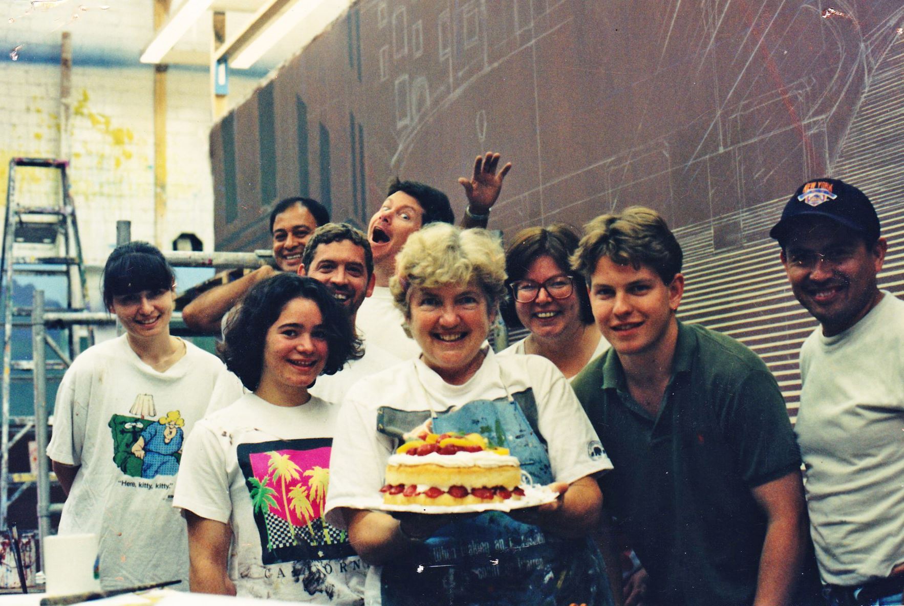
Erin Hanson (age 13) in the mural studio, second from the bottom left.
These were the days before digital printing and wide-format, roll-to-roll canvas and vinyl prints. Thirty years ago, if you wanted a large piece of art for your casino, cruise ship, or restaurant, you called up a mural company and they painted it for you. The paintings I worked on during my mural career were displayed all over the world, but mainly seemed to end up in Las Vegas, including the Stratosphere, which was being built at the time. We painted dogs playing cards, an entire circus-themed series, and I’m pretty sure I helped paint the fluffy clouds that adorn the ceilings of the Venetian.
I loved the grand impact of a colossal painting. My favorite piece we made was a 30-foot-tall painting of a herd of stampeding buffalo running straight at the viewer. The immense size of the artwork made me feel completely immersed in the scene, imagining the beast’s rolling eyes and hot, foaming breath.
While working at Paytan Place, I saw the grimier side of being an artist as well. I watched as Mr. Paytan had to destroy and re-paint 300 feet of canvas because of a miscommunication in the commission agreement. And while there were times that business boomed and everyone worked 18-hour days, at other times, only one or two artists remained employed, and I was told, “We will call you if we need you.”
This is probably why I was separately advised by each of these grown-up artists not to pursue a career in art. “You are smart and hardworking. You can get a much better career than this,” they said.
And so, after working at Paytan Place for three years, I adopted a new path that brought me to pre-medical at UC Berkeley, eventually obtaining a bioengineering degree in 2003.
Painting Through PreMed
I never put down my brush while in college, however. I have always been enamored with Japanese brush art, and I created many brush paintings of lanky pine trees and fog-shrouded mountains. I took watercolors to another level, and I started emulating Jim Lee’s comic artwork from his Batman graphic novels. Similar to Japanese paintings, graphic novel art had strong, sure lines in black ink that separated the planes of color. Less was more – a single brush stroke could have enough emotional impact to carry the whole composition.
Making a Living as an Artist
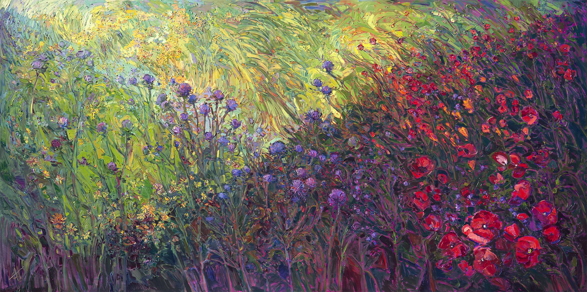
I’ve told this story before, but it wasn’t until years after graduating from college that I took up oil paints again and decided to start creating one painting a week. The location was Red Rock Canyon, the inspiration was rock climbing, the color was the warm morning light of the golden hour, and the medium was oil paints—highly textured and deeply pigmented, the perfect method to capture the rocks I was climbing.
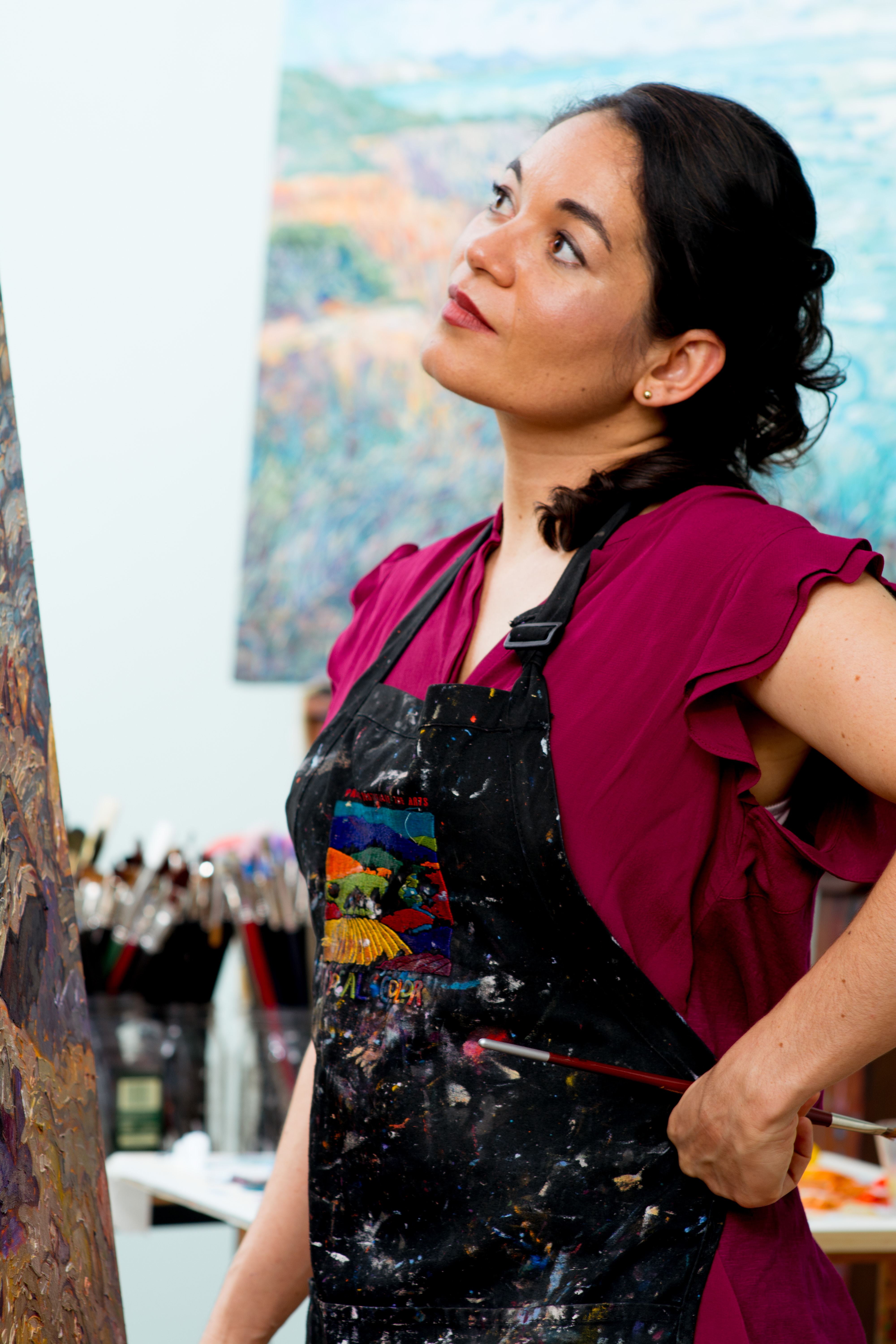
Now that I’m all grown up and did find a way to make a living as an artist, I’ve come full circle back to creating mural-sized paintings, but this time with oil paint.
The theme for my big collection release this year is Colossal-Sized Works. I want to create the same emotional impact with these large oil paintings that the oversized acrylic murals did when I was a teenager. I want the viewer to feel like they can step right into a different world when they stand in front of my painting.
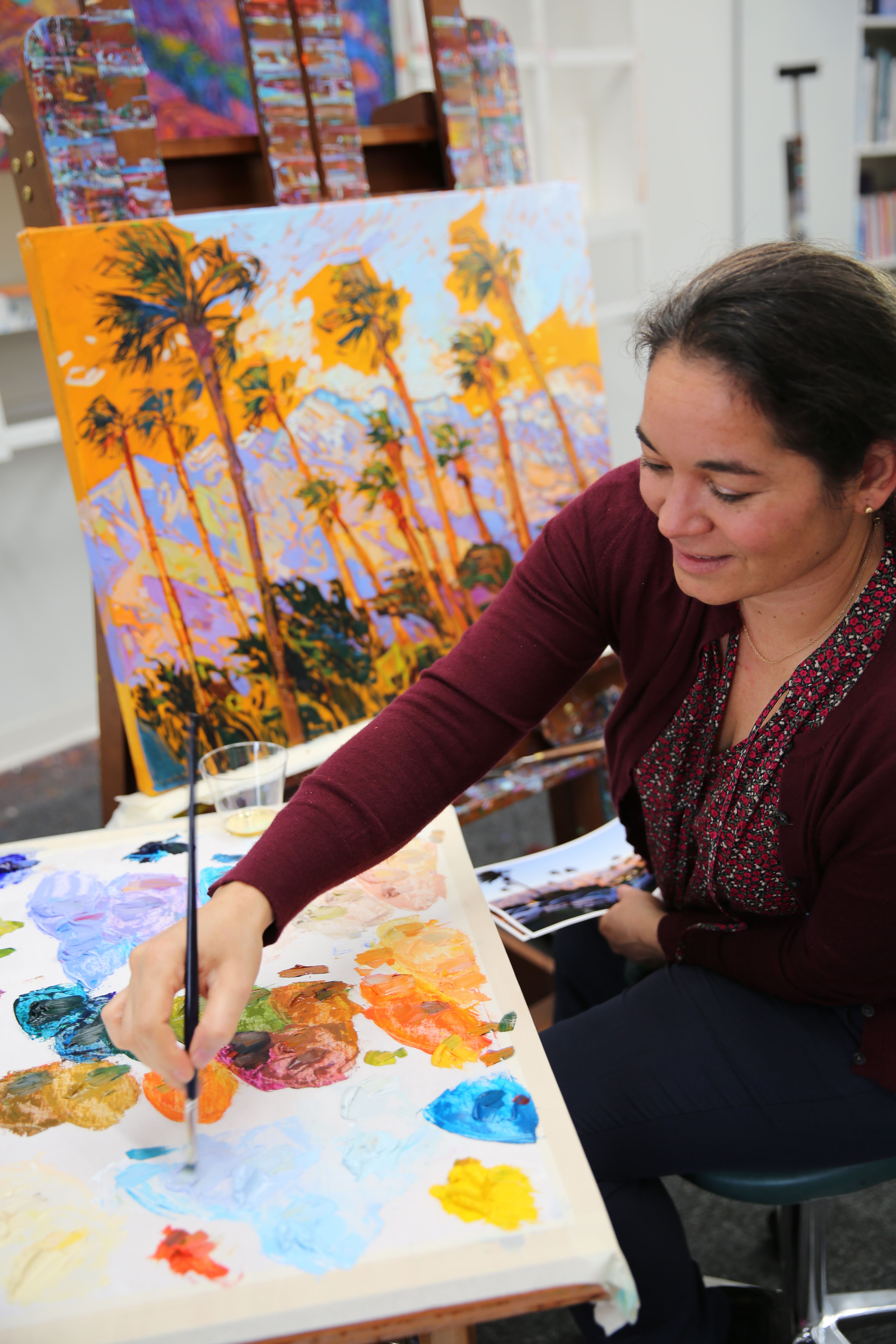
The biggest challenge working in my Open Impressionist technique on a grand scale (which means not overlapping my brushstrokes and getting each stroke right the first time) is planning out the composition in enough detail so I can paint the piece from two feet away and know it is creating the effect I want from ten feet away. I have experimented with many ways of pre-planning large works, from inventive underpaintings to covering three rolling palettes with every color that will appear in the painting before I pick up a brush.
Nothing beats just good ol' experience when painting large-scale works, however. Each piece I complete lets me figure out a better way of tackling color, light, and composition on a canvas larger than I am.
A few months ago, I measured the walls in my gallery and worked out the largest paintings I could hang in there. I am about a third of the way through painting The Colossal Collection. You, of course, are invited to the artists' reception, which will take place this summer at my gallery in Oregon wine country.
And now, back to the canvas.
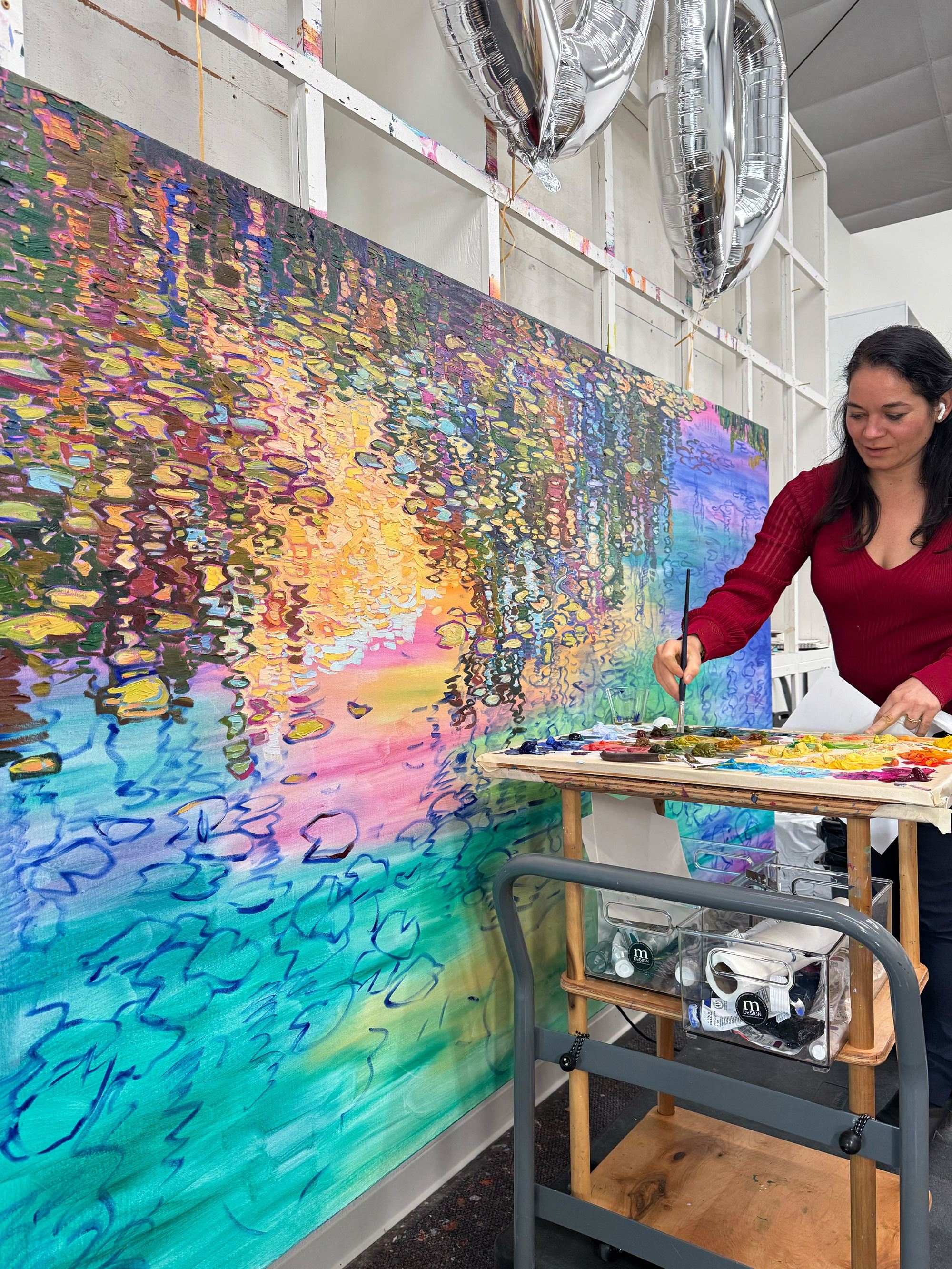
Erin Hanson, standing on a rolling cart to paint Lilies Dreaming, a Colossal Collection painting measuring 96 x 56 inches.
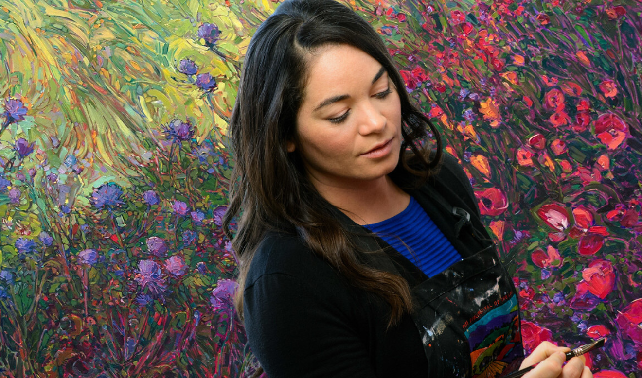
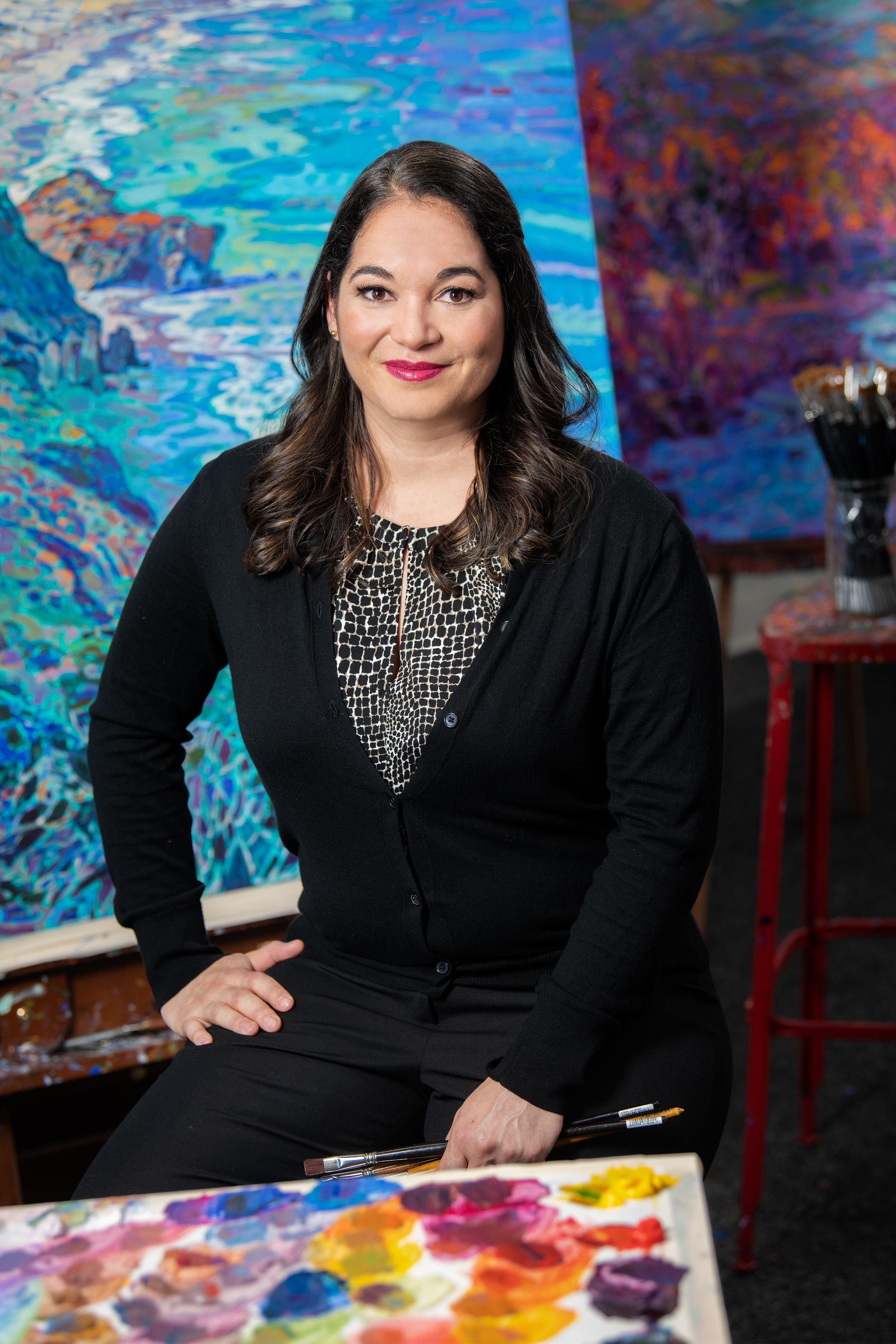
 ERIN HANSON has been painting in oils since she was 8 years old. As a young artist, she worked at a mural studio creating 40-foot-tall paintings on canvas, while selling art commissions on the side. After getting a degree in Bioengineering from UC Berkeley, Erin became a rock climber at Red Rock Canyon, Nevada. Inspired by the colorful scenery she was climbing, she decided to paint one painting every week for the rest of her life. She has stuck to that decision ever since, becoming one of the most prolific artists in history. Erin Hanson's style is known as "Open Impressionism" and is now taught in art schools worldwide. With thousands of collectors eagerly anticipating her work and millions of followers online, Hanson has become an iconic, driving force in the rebirth of contemporary impressionism.

|
Seven Years of Art Festivals Erin Hanson shares how selling at art festivals was a transformative experience for her and open impressionism Saturday, March 1, 2025 My first seven years of selling at art festivals were transformative. I realized I could paint for a living, and the rising demand for my paintings allowed me to paint more and more, giving me the opportunity to hone my skills and develop the tenets of Open Impressionism. Read More → |
|
|
|
Seven Years of Art Festivals Erin Hanson shares how selling at art festivals was a transformative experience for her and open impressionism Saturday, March 1, 2025 My first seven years of selling at art festivals were transformative. I realized I could paint for a living, and the rising demand for my paintings allowed me to paint more and more, giving me the opportunity to hone my skills and develop the tenets of Open Impressionism. Read More → |
|
How to See Color Capturing the essence of Nature’s beauty. Saturday, February 1, 2025 I am often asked how I see the colors I see when I am painting. This question has been on my mind lately, and I thought you might enjoy hearing about how I approach color in each new painting I begin. Read More → |
|
|
|
How to See Color Capturing the essence of Nature’s beauty. Saturday, February 1, 2025 I am often asked how I see the colors I see when I am painting. This question has been on my mind lately, and I thought you might enjoy hearing about how I approach color in each new painting I begin. Read More → |
|
How to Find Inspiration How one Professional Artist Finds Inspiration Sunday, December 1, 2024 I am often asked how I stay inspired. My answer is to point to a 2-foot-tall stack of photos and say, “These are the paintings I wish I could start right now!” While I never run out of things to paint, I thought you’d find it interesting to hear about how I keep myself inspired. Read More → |
|
|
|
How to Find Inspiration How one Professional Artist Finds Inspiration Sunday, December 1, 2024 I am often asked how I stay inspired. My answer is to point to a 2-foot-tall stack of photos and say, “These are the paintings I wish I could start right now!” While I never run out of things to paint, I thought you’d find it interesting to hear about how I keep myself inspired. Read More → |
|
Erin Hanson’s Big Birthday Bash You're Invited to Erin's Birthday Party on July 13th Monday, July 8, 2024 The Erin Hanson Gallery will be hosting a big birthday bash for Erin Hanson on Saturday, July 13th, 2024 - and you are invited to join us! This is going to be a joyful, fun party filled with gorgeous art, delightful treats, and local wines. If you can make it, we certainly hope you will join in the celebration! In advance of her party, we pulled the guest of honor aside to talk about a few of her favorite things, along with her plans for the future. Read the entire interview here. Read More → |
|
|
|
Erin Hanson’s Big Birthday Bash You're Invited to Erin's Birthday Party on July 13th Monday, July 8, 2024 The Erin Hanson Gallery will be hosting a big birthday bash for Erin Hanson on Saturday, July 13th, 2024 - and you are invited to join us! This is going to be a joyful, fun party filled with gorgeous art, delightful treats, and local wines. If you can make it, we certainly hope you will join in the celebration! In advance of her party, we pulled the guest of honor aside to talk about a few of her favorite things, along with her plans for the future. Read the entire interview here. Read More → |
|
Erin Hanson Answers School Children's Questions School children often reach out to Erin with art questions. Here are some answers. Thursday, May 2, 2024 Recently, two sets of school students reached out to Erin to ask her questions about her work and to share their own thoughts and comments as well. The questions and comments were very astute and wonderful, so we thought we would share the Q&A here on the blog. Read More → |
|
|
|
Erin Hanson Answers School Children's Questions School children often reach out to Erin with art questions. Here are some answers. Thursday, May 2, 2024 Recently, two sets of school students reached out to Erin to ask her questions about her work and to share their own thoughts and comments as well. The questions and comments were very astute and wonderful, so we thought we would share the Q&A here on the blog. Read More → |
|
An Interview with Erin Hanson, Alchemist of Color How Erin Hanson became an artist, in her own words Wednesday, November 1, 2023 I’ve spent over 10,000 hours just mixing paint and this has given me a lot of opportunities to explore what color can do. Now I can color match anything. I can color match any photograph, any paint color or fabric swatch – any object. I spend an hour or two every day mixing color for my paintings. In fact, color is such an important part of how I compose my paintings that I premix my entire palette before I ever pick up a brush to begin painting. Read More → |
|
|
|
An Interview with Erin Hanson, Alchemist of Color How Erin Hanson became an artist, in her own words Wednesday, November 1, 2023 I’ve spent over 10,000 hours just mixing paint and this has given me a lot of opportunities to explore what color can do. Now I can color match anything. I can color match any photograph, any paint color or fabric swatch – any object. I spend an hour or two every day mixing color for my paintings. In fact, color is such an important part of how I compose my paintings that I premix my entire palette before I ever pick up a brush to begin painting. Read More → |
|
Capturing the Colors of Wine Country Expanding my repertoire from deserts to wine country Thursday, June 1, 2023 Learn how Erin Hanson expanded her repertoire, painting primarily red rock and desert-scapes to wine country and more pastoral landscapes. Read More → |
|
|
|
Capturing the Colors of Wine Country Expanding my repertoire from deserts to wine country Thursday, June 1, 2023 Learn how Erin Hanson expanded her repertoire, painting primarily red rock and desert-scapes to wine country and more pastoral landscapes. Read More → |
|
Erin Hanson: American Master Artist by James Peck Tuesday, June 14, 2022 I first encountered Erin Hanson’s art in New York City. Ken Ratner, a talented artist, curator, and writer, had invited me to his Manhattan apartment to look at his burgeoning art collection. It was a cozy apartment filled with art befitting a collector of modest means but large ambitions. As I worked my way through dozens of works of art, I noticed two things. First, Ratner had an unerring eye for quality. Second, his collection featured the most quintessential of American subjects, the land. Many of America’s finest artists, from Thomas Cole to Albert Bierstadt to Edgar Alwin Payne, had elevated the land to the highest art form. If the land was prominent within Ratner’s collection, then Erin Hanson was the star in the Western sky. I was immediately struck by her talent. Read More → |
|
|
|
Erin Hanson: American Master Artist by James Peck Tuesday, June 14, 2022 I first encountered Erin Hanson’s art in New York City. Ken Ratner, a talented artist, curator, and writer, had invited me to his Manhattan apartment to look at his burgeoning art collection. It was a cozy apartment filled with art befitting a collector of modest means but large ambitions. As I worked my way through dozens of works of art, I noticed two things. First, Ratner had an unerring eye for quality. Second, his collection featured the most quintessential of American subjects, the land. Many of America’s finest artists, from Thomas Cole to Albert Bierstadt to Edgar Alwin Payne, had elevated the land to the highest art form. If the land was prominent within Ratner’s collection, then Erin Hanson was the star in the Western sky. I was immediately struck by her talent. Read More → |